I have a damn good reason for neglecting this site in recent months. Before I get there, however, allow me a moment of self-awareness as I acknowledge the silliness of the “It’s been a while since I posted” post. My brother Chris has a running joke with me about shitty bloggers who take a few weeks off then come back with this kind of thing, promising to write more and begging for forgiveness, as if their audience had been checking in every day, dying for their beloved blogger to return. The Onion did this all the time with a character named Jim Anchower, who started his columns with, “Been a while since I rapped at ya.”
Well, of course it’s been a while since I rapped at ya. I’m not a full-time blogger. I use this site to share backstory on some of the pieces I write for M&F when I think people might find it interesting. No one’s sitting around waiting for this stuff.
But in the spirit of Mr. Anchower and his real-life counterparts, I want to share why I’ve been away for so long—not because you’ve been checking, but because I think you’ll find it interesting.
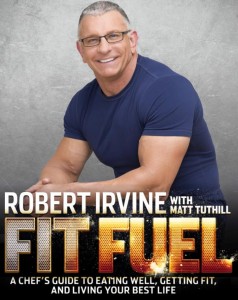
For the past two years, I’ve had a part-time job on top of my ever-expanding duties at M&F: I co-authored a book with Chef Robert Irvine of Food Network fame. Its title is Fit Fuel, and it shares Robert’s training and nutrition advice, recipes, and motivation for people trying to make a big life change. Since I’ve been editing Robert’s column in M&F for the past four-plus years, he asked me if I’d get involved and I immediately said yes.
My role as co-author was not just to help Robert get his thoughts down on paper, but also to help assemble the great team we had producing the book. Photography and design play a hugely important role in a book of this nature, so I recommended the best guys I knew: Ian Spanier, who I’ve worked with for years at M&F, handled the photography. Sean Otto, the creative director of FLEX magazine, handled the design.
The cover shows the perfect marriage of their efforts:
Ian’s photo is beautiful. Robert looks strong and authoritative, yet welcoming and friendly. In essence, it perfectly captures everything about his persona that made Restaurant: Impossible such a huge success. Sean’s title font design, layout, and choice of background is evocative of a movie poster, and I couldn’t be happier with the end result. I’m a harsh critic, especially when I’m involved in the project. We struggled a bit to find the right balance on the first few mockups, but I’m really in love with the final version, and thank goodness Robert was, too.
As for an editor, I asked my good friend and colleague Nina Combs. She’s a genius for every aspect of the editing process and a brilliant writer herself. I knew Robert could rest easy with Nina watching over every last word.
I’ll have more to share about this book in the coming weeks as it hits the press and starts to see widespread distribution. There were a few long days and sleepless nights—particularly in the few weeks leading up to it hitting the press—and the best stories always come out of days like that. I owe a huge thank-you to my wife, Jill, without whom I would never have been able to pull this off. I’ve got a real-life superhero in my corner, and I shudder to think of what my life might be like had I never met her.
On the work front, my attention is fully fixed on M&F again, and I’m working on the October cover story. It’s an exciting one, as the cover subject is a man whose career I’ve followed since I was a kid. I can’t say his name yet, but I’ll drop a hint: He has a bust in Canton.
Thanks, cats. I’ll rap at ya real soon. Promise.
